Ezee Book
Making hotel booking fit the way people actually stay.
A mobile booking experience built around hotel discovery, flexible stays, room selection, booking, and everything that happens after.
[ 01 ]
The Project Overview
My first mobile product. And definitely not the simplest one.
Ezee Book started as a hotel-booking app focused on full-day stays.
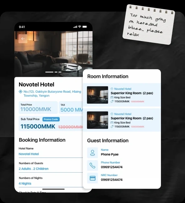
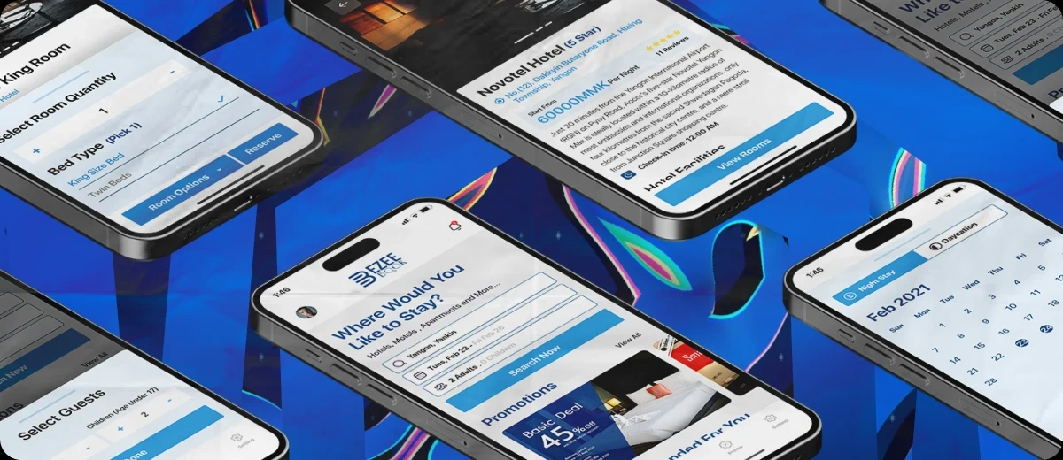
I worked across the full experience, from discovery and room selection to booking history, reviews, promotions, and account management.
What looked simple at first got a lot more interesting once the booking behaviour changed.
[ 02 ]
The Problem
We designed for full-day stays. Then we found the edge case that wasn't really an edge case.
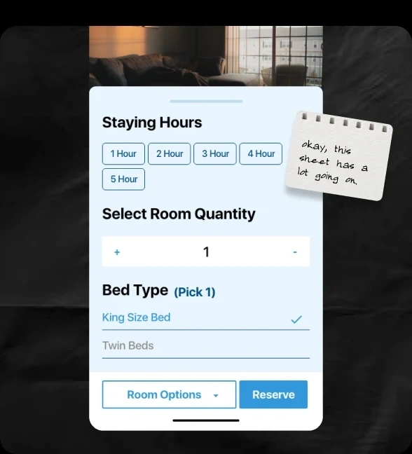
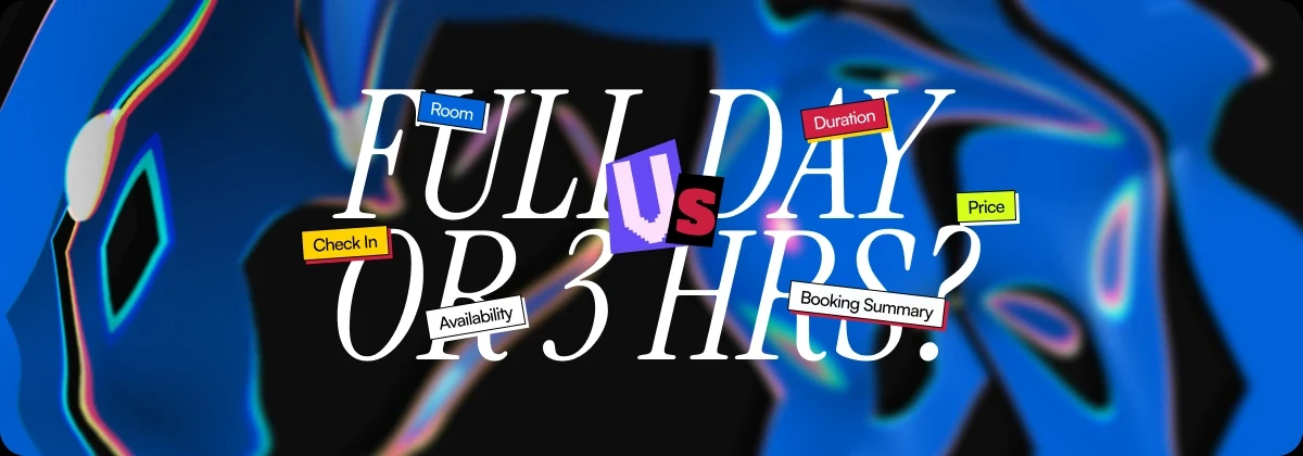
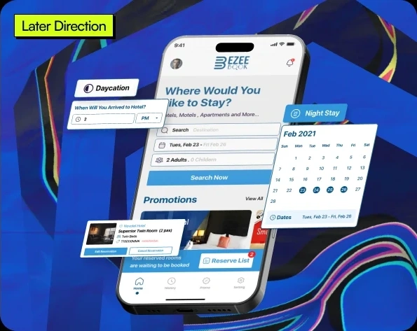
Some guests weren't booking rooms for the whole day. They only needed a few hours. That changed more than the duration selector.
It affected availability, pricing, room options, check-in, booking details, and how the entire reservation flow worked.
[ 03 ]
The Approach
Same room. Different stay.
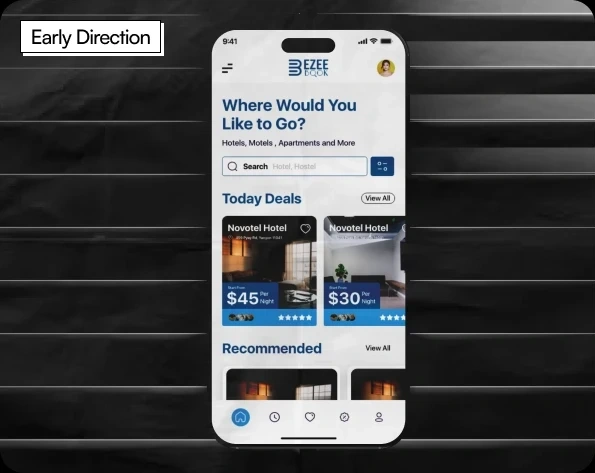
Instead of building a separate short-stay experience, the booking model was adapted to support both full-day and hourly stays within the same product. At the same time, the experience shifted from a browse-heavy direction toward a clearer booking-first journey.
Users could still discover hotels, compare rooms, configure their stay, and review everything before committing.
[ 04 ]
The Solution
One booking system, built for both full-day and hourly stays.
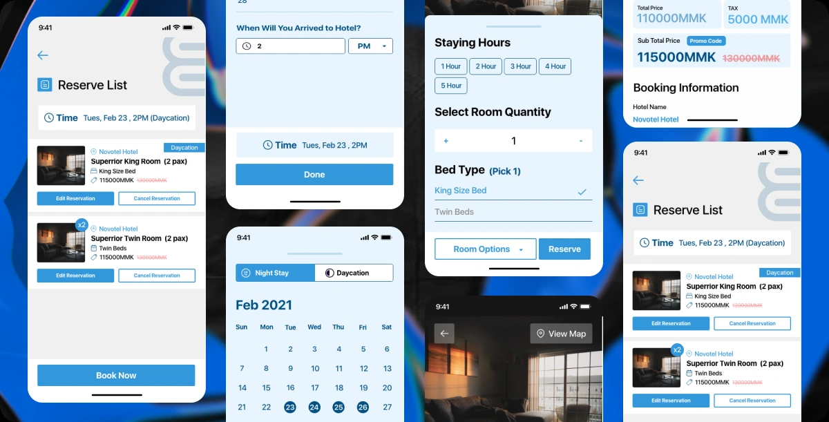
Instead of creating a separate short-stay flow, we adapted the existing booking journey around flexible stay duration. Users could choose the hotel and room first, then configure how long they needed it, along with room quantity, bed type, and booking details, before reviewing everything in the Reserve List.
The rest of the product stayed connected around that same booking model, from discovery through booking history and reviews.
[ 05 ]
Looking back
5 Years Later… yeah, I see it.
Would I design all of it the same way today? Absolutely not. Some screens are too busy. Blue is doing way too much work. A few interactions definitely didn't need their own full screen. But I still like what this project taught me.
The screens aged. The lesson didn't.
One small assumption changed the entire booking experience. And this was probably the first project that made me realize I wasn't just designing screens anymore. I was designing what happened between them.